
This is a continuation of a 5 Part series on what is required to create amazing online experiences. If you have missed Part 1, you can read it by clicking here.
Principle #6 Apply Best Practice (the “Science”)
In 2015, the Harvard Business Review (HBR) conducted research on the future of growth in business and found the key was to apply and leverage best practices….
Slow growth comes from a failure by many firms to adopt best practices.
There has been an incorrect assumption among businesses around the availability of digital best practices to leverage.

Now 20 years on there are best practice methodologies, principles and processes for eCommerce, digital strategy, and digital conduct. Like in the traditional business world, businesses utilise and rely on best practices to shape their conduct.
Digital should not be treated differently. Best practice expedites a retailer’s digital evolution.
One example of proven best practice is interaction cost management discussed in Principle 3.
Takeaway: The application of best practice sets the foundation for a retailer’s digital evolution.
Principle #7 Wireframing
The process of translating amazing online experiences from the planning stage to the screens is done through wireframes. Wireframes are ugly plain boxes guiding page element placement for all pages of a site across digital touchpoints.
Wireframes ensure the integrity of the online experience strategy by eliminating the subjective (decisions made by personal tastes and opinions) and emotional influences of look and feel.
The impacts of subjective and emotional influences can be felt if businesses translate their online experience strategy directly to designed visual mock ups.
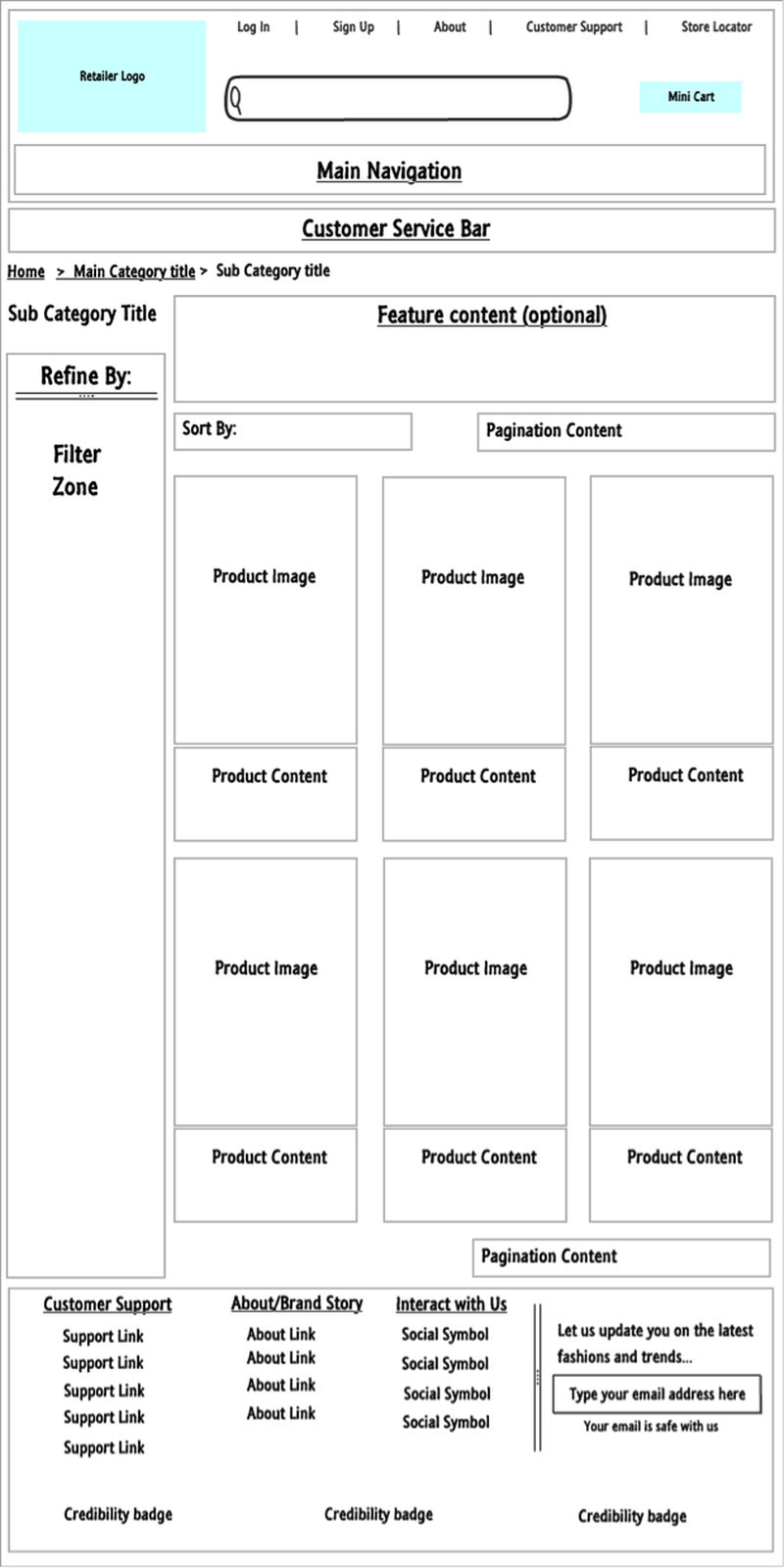
Wireframes (Figure 1) provide design teams the context they need to visually represent the brand’s DNA and bring the plan to life.
The other benefit to the use of wireframes is it speeds up the design process. Though it appears the addition of the wireframe step would extend the overall project timeline, it does the opposite.
The design process does not begin until wireframes are approved by stakeholders. Once approved, the overlaying of brand, look and feel and content (placeholders) becomes easier to digest. The cyclical black-hole of design amendments disappears .
Takeaway: Wireframes are a strategic tool protecting the customer experience plan from personal tastes and opinions of stakeholders with influence.
Principle #8 Design “Consumer First” not “Mobile First”
When designing for the consumer (not the screen type) the retailer has the ability to leverage varying screen sizes to improve experiences.
In 2014, House of Fraser moved to a "mobile first" design approach (Figure 2). This from Andy Harding, executive director for multichannel at House of Fraser:
Consumer shopping habits are constantly evolving and given we now see more than 50% of our online traffic coming from mobile devices, we have changed our design strategy to ensure we provide the best possible experience for our online customers .
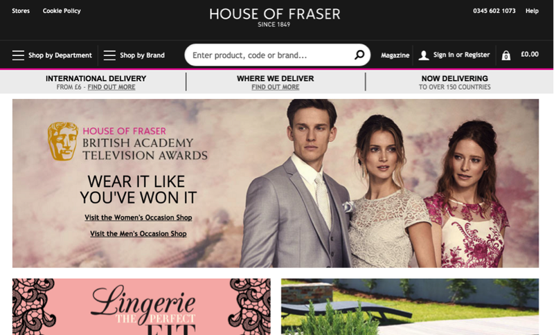
Their page element and content treatment on mobile is exceptional, however, House of Fraser loses impact when their design translates to desktop screens (Figure 2). The desktop design would be better suited to display main categories horizontally to capitalise on this common navigation convention. This one change would reduce interaction cost.
The mobile first approach works to the philosophy of simplifying experiences for those who come from mobile and move to desktop to leverage the use of the same navigation treatment. This approach assumes the way a consumer conducts his/her steps within a journey are the same across devices.
Pernice and Budiu from the Neilson Norman Group in June 2016 wrote about the “less fortunate effects” of mobile first designs:
The issue (with mobile first) is taking sufficiently good mobile designs and porting them to desktops where they do not work as well. Mobile-first should not equal mobile-only.
Pernice and Budiu clarify it is the uncompromising mobile first approach which makes the other screens an afterthought.
A recent study was completed by Baymard Institute specifically analysing the different ways consumers use navigation across devices . They tested online retailers who use hidden menu systems on the mobile site and standard horizontal main navigation systems with mega menus ("mega menus" are menus which appear when consumers mouse over main categories in the horizontal main navigation) on their desktop site.
Baymard Institute found clear trends when consumers took back steps, they....
- Use the browser "Back" button on mobile screens, and
- Use the main navigation and the mega menu on desktop screens.
The qualitative data confirms this change in behaviour is due to the visually accessible menu systems on desktop. Instead of applying the amazing online experience plan to the mobile screens and scale up, do the following:
- Simultaneously create wireframes for all screen types
- Consider consumer context per screen (what experience is the consumer looking for on a particular screen)
- Do not forget about the enlarged monitors which are growing in popularity for desktop (upscaling)
This enhances experiences by…
Allowing the retailer to emphasise design elements specific to each screen type (for example emphasising localised content on mobile screens). Providing a greater standard of functionality control per screen type (leverage the different navigation systems). Visual design elements can be treated differently for each screen type(better utilisation of hover effects on desktop and design to compensate for the absence of hover effects on touch screens).
“New” Touchpoint Future Proofing
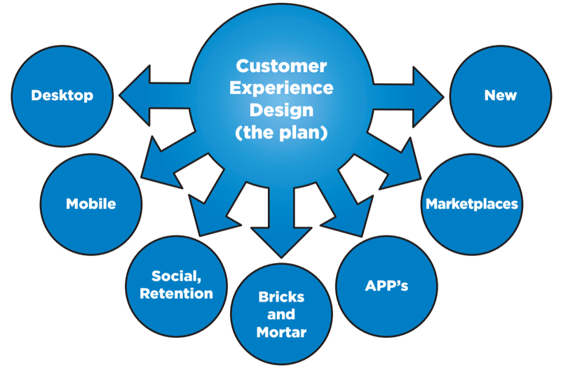
The amazing online experience plan needs to sit above all touchpoints (Figure 3). The process of translating this plan to touchpoints (via wireframes) does not begin until planning is completed.
This principle of designing for consumers, not screens, prepares retailers for new internet enabled touchpoints.
The rise in new internet enabled mobile touchpoints continues to gain momentum. Figure 4 shows the forecast of accessible internet devices and the mix by 2020:
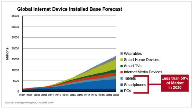
The current “go to” devices will comprise 50% of all digital touchpoints by 2020. The “internet of things” (IoT) has been intentionally excluded due to the engagement limitations available with smart fridges and thermostats (as an example).
By keeping a “consumer first” design philosophy, the infusion of future touchpoints is made easier. You (the retailer) know the experiences to convey, the effort comes in how to apply it to the new device.
Takeaway: Keep the amazing online experience plan above touchpoints and simultaneously build wireframes across each when translating.
Continue reading this series by clicking here to see Part 4.
This article was as tagged as Best Practice , Customer Experience Design , SEO