The topic of placing products on the home page always comes with debate, but the principle is simple and the reasons not to present products are straightforward when you think in the context of the consumer journey.
Purpose of the Home Page
The purpose of the home page is to maintain a consumer's buying momentum by offering varying methods for them to move on to the next step of their information gathering/buying journey as possible.
A mix of functionality and content comprise three fundamental methods to achieve this:
- Large obvious search box,
- Clearly displayed main navigation (and mega menu for desktop screens), and
- Repeating the main categories in the body of the home page.
Consumers are on a Mission
When a consumer lands on a home page they are already at least one to two steps into their journey and want to keep moving closer to their goal(s).
Because a retailer does not know the consumer's intent at this stage, making assumptions by presenting products does not add value to the consumer journey. By presenting products too early valuable realestate is occupied with irrelevant content resulting in high home page bounce rates.
The consumer who lands on a home page typically comes from varied sources. A few common examples:
- Typed the retailers name into a search engine.
- The consumer bookmarked the retailer's URL.
- The consumer came from an email marketing campaign but instead of clicking on specific calls to action went to the home page.
Taking into consideration the scenarios above, any bounce rate greater than 10% to 15% should be perceived as a problem. Why? These people know the retailer. They seeked the retailer out, made the effort to view the home page for a reason, and left the site after only viewing the home page.
There are two types of retailers who place products on their home page:
Type 1. Retailers who hope their new arrivals, top sellers, hot deals, and/or customer favourites, will be relevant enough.
Type 2. Retailers who apply technology to present products consumers have either previously viewed or purchased.
Both are getting it wrong.
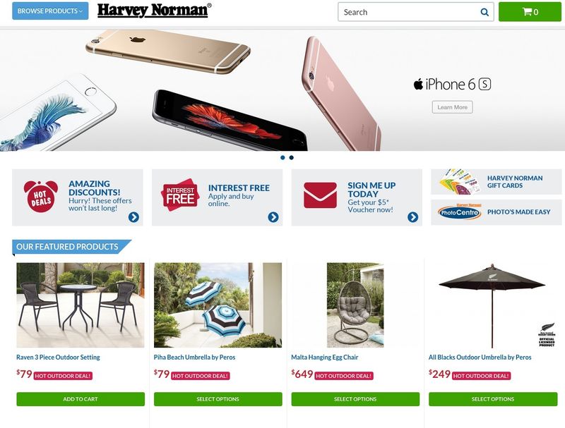
Harvey Norman assumes all consumers who come to their home page are interested in deck furniture because it's spring.
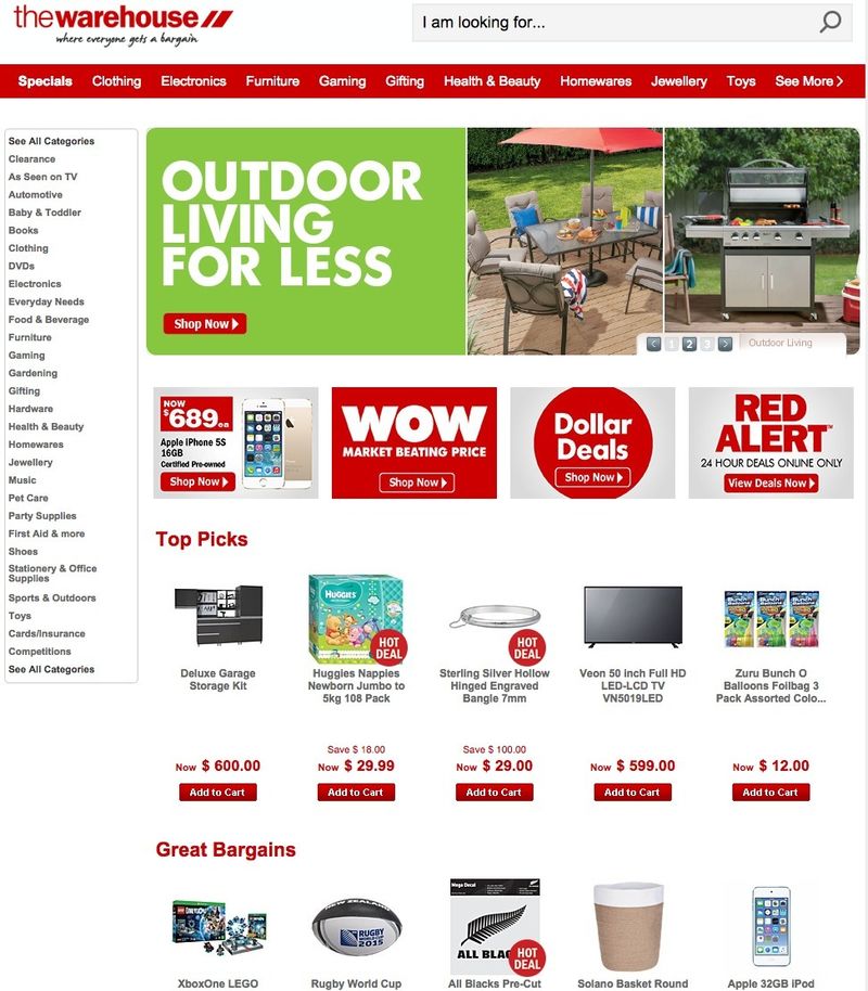
How does The Warehouse come to the conclusion a consumer has interest in the featured products on their home page when taking into consideration its enormous product range?
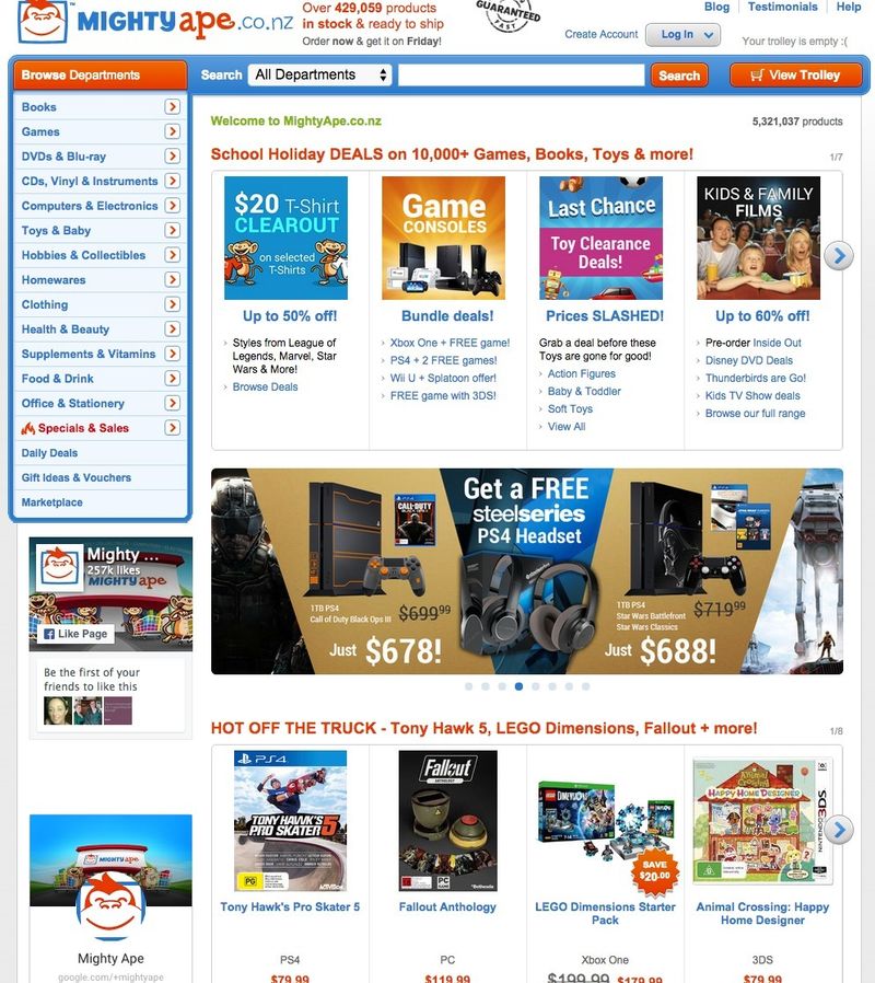
The same goes for Mighty Ape...
There are retailers who are the exception, but they are the minority.
Inc.comhas this to say about today’s consumer and the difficulty in anticipating buying intent…
Comprehensive use of demographic data will be useful, but no longer a competitive differentiation. And even basic "interest" and social information won't be sufficient to win the battle because the new behavior drivers won't be uniform or consistent, even on an inpidual basis.
Each time a customer now appears -- it's essentially a brand-new day dictated and determined in the moment by the customer's then-dominant and most pressing desires.
Google talks extensively about what Inc.com calls being "in the moment”. Google calls it "micro moments"…
Mobile has forever changed the way we live, and it’s forever changed what we expect of brands. It’s fractured the consumer journey into hundreds of real-time, intent-driven micro-moments. Each one is a critical opportunity for brands to shape decisions.
The "comment trolls" would argue the placement of products such as “New Arrivals” or “Most Popular Sellers” enhance sales when featured on the home page.
When considering the consumer journey, it makes more sense to properly merchandise these feature products on dedicated landing pages, not crammed on the home page. Create a banner on the home page with a call to action guiding consumers to these landing pages and do a better job of selling them.
It would be strategic to dedicate more room for products that comprise the 80/20 rule.
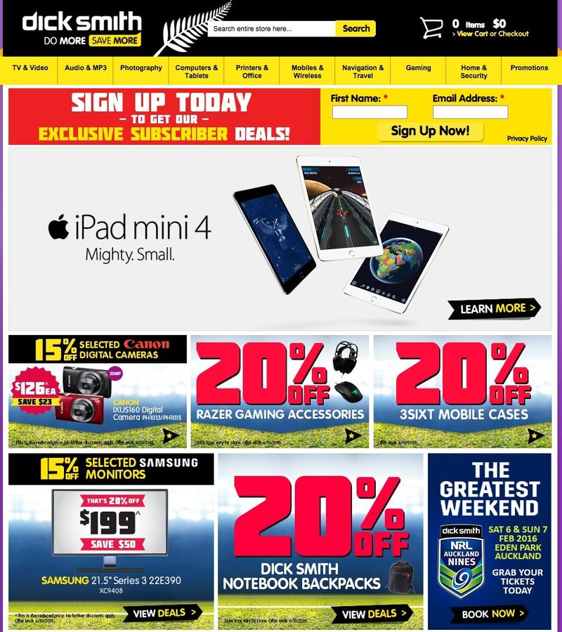
Dick Smith may not be filling its page full of products, it is more focused on featuring deals, but this retailer is still not capitalising on the true purpose of the home page. With the size of its product range it would benefit from the recommendations above.
An example of a retailer doing this right would be Farmers:
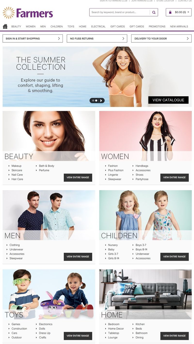
Displaying sub categories within the tiles not only provide consumers a faster way to move deeper into the site, it does an effective job in communicating the vast range of products available within each main category.
The single category title "Home" is vague, but the tile in the body of the Farmers home page paints a clearer picture. Heat map analysis by this retailer has proven this layout to be extremely effective.
Translating to Tablet. Farmers home page content also elegantly translates to tablet screens providing large "finger targets" and a very effective methods for consumers to drill down. Main category links become less effective "finger targets" on tablet screens and the mouse-over effect for the mega menu no longer becomes a usable device to prompt navigation options.
This same philosophy applies for smartphone screens. Focus on navigation content, not products.
With today’s consumer being far less tolerant of irrelevant content, the risks of placing product content on the home page far outweigh perceived benefits.
Products on the home page add noise, distract consumers from their intended path and contradicts the purpose of the home page.
This article was as tagged as Best Practice